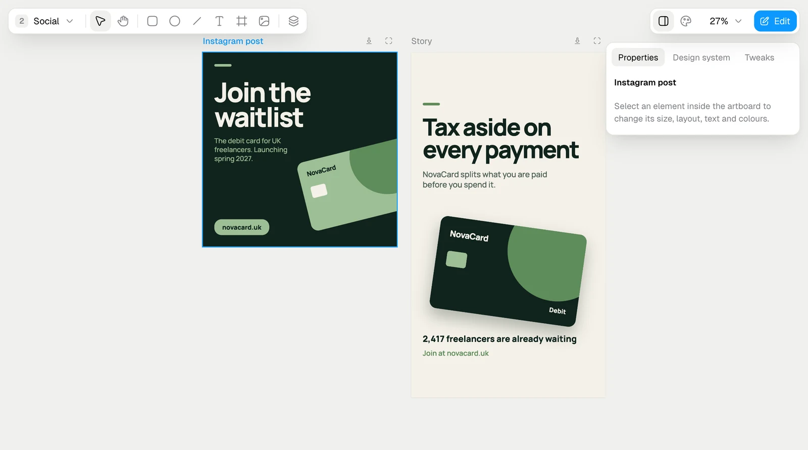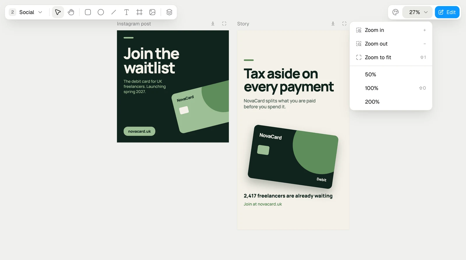
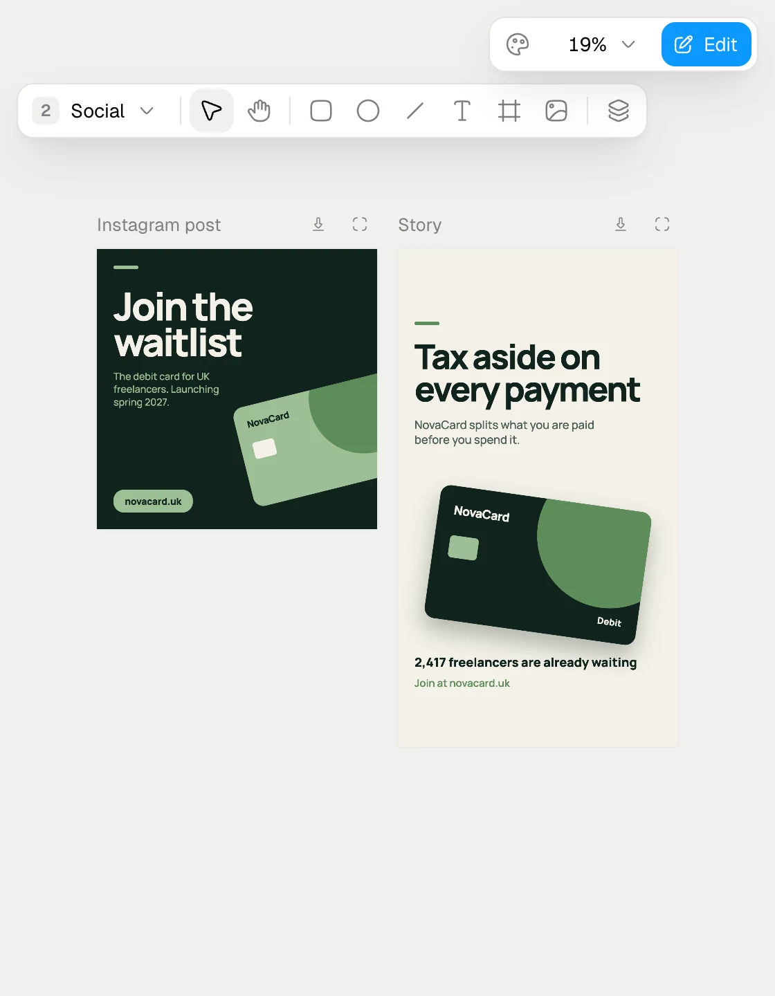
A design is a canvas of artboards: an Instagram post, a story, an A4 poster, each at its real size. Artboards sit on pages, so the social posts and the print can live in one design. Changes save on their own a moment after you make them.
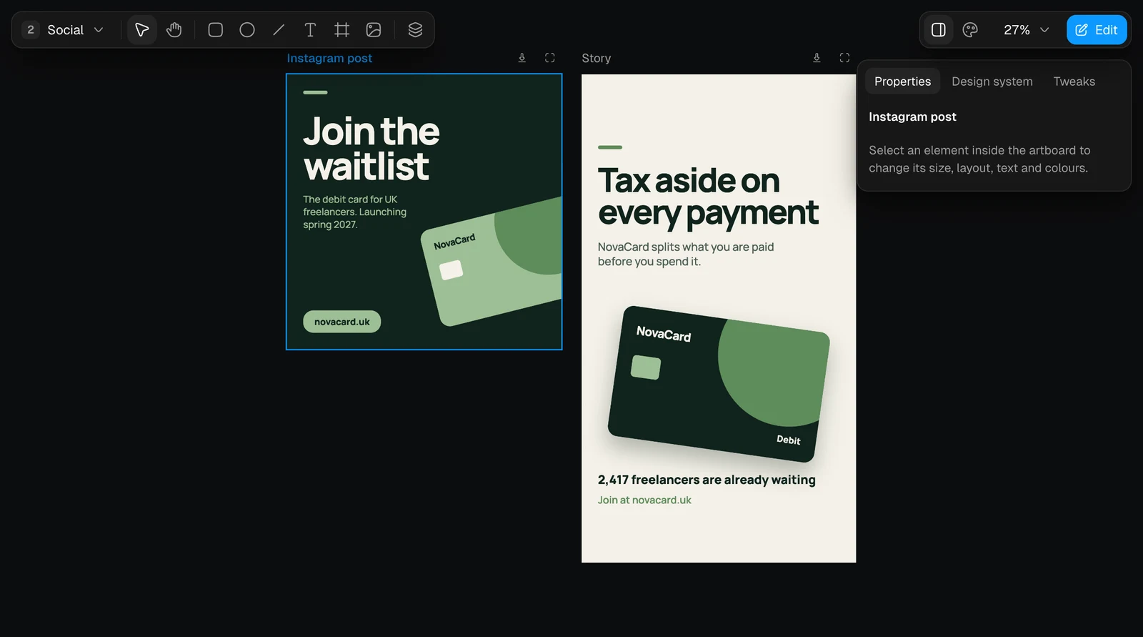
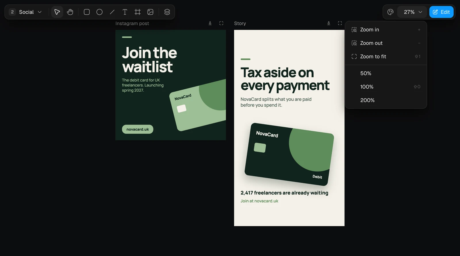
The Design editor with two artboards on the Social page, light themeThe Design editor with two artboards on the Social page, dark theme
PartWhat is in it
Pages, top leftHow many pages there are and which one is open
ToolbarSelect, Hand, Rectangle, Oval, Line, Text, Frame, Image and Layers
ArtboardsEach with its name above it, Download and Open on its own
Top rightThe design system, zoom and Edit
Everything that works on a slide works on an artboard the same way: selecting, the properties, fonts, fills, layout, the element actions, layers and adding things. See Change what is on a slide.

Pages

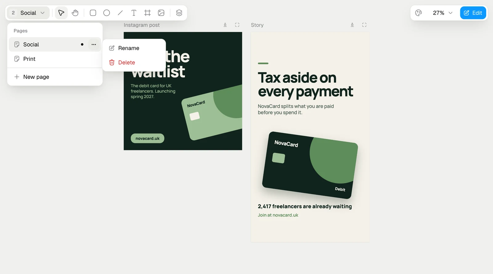
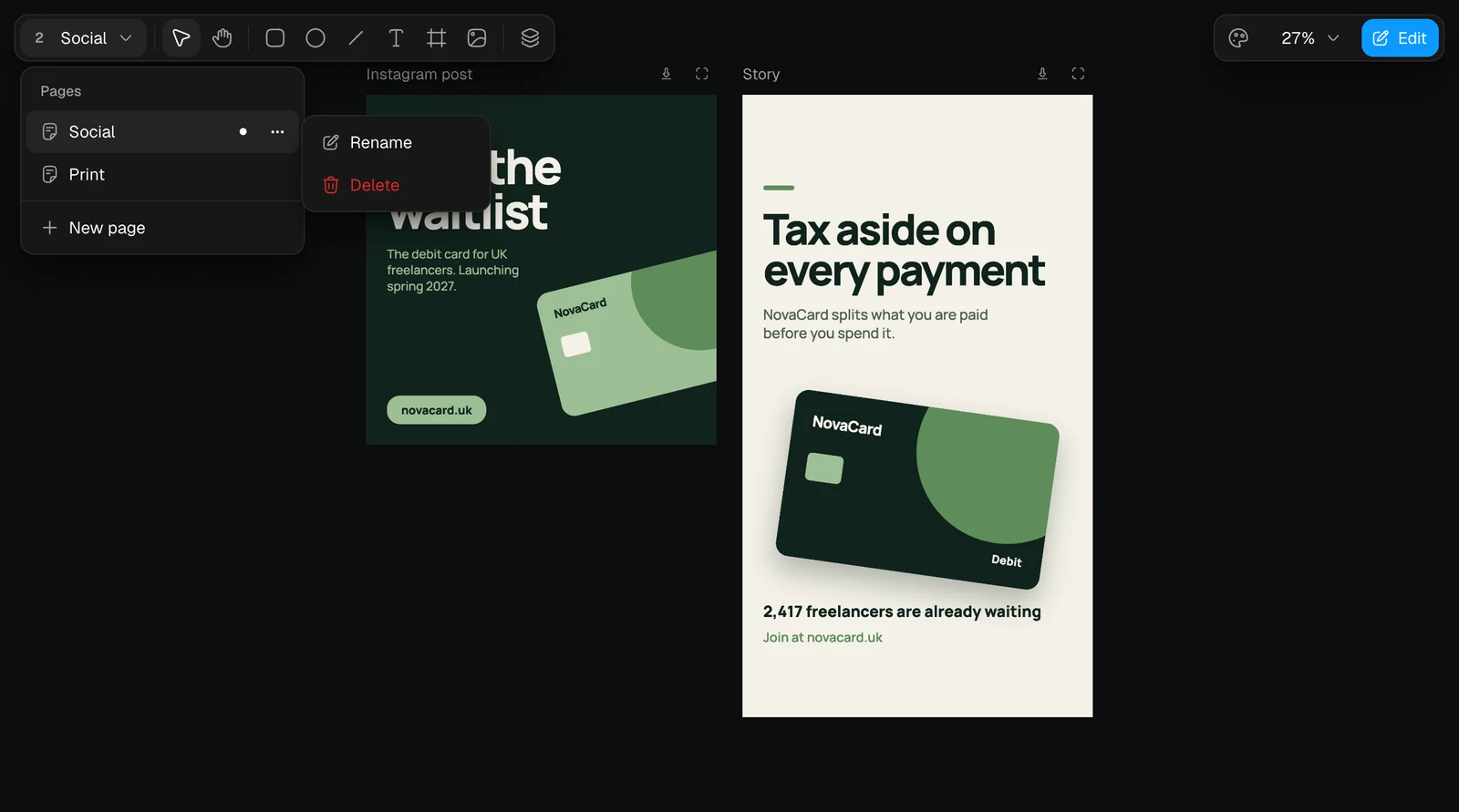
The page button lists the pages. Pick one to open it, or New page to add one.
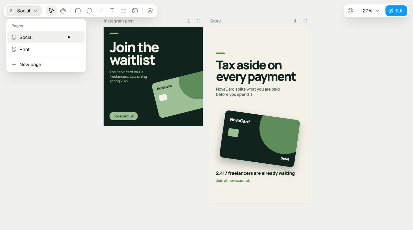
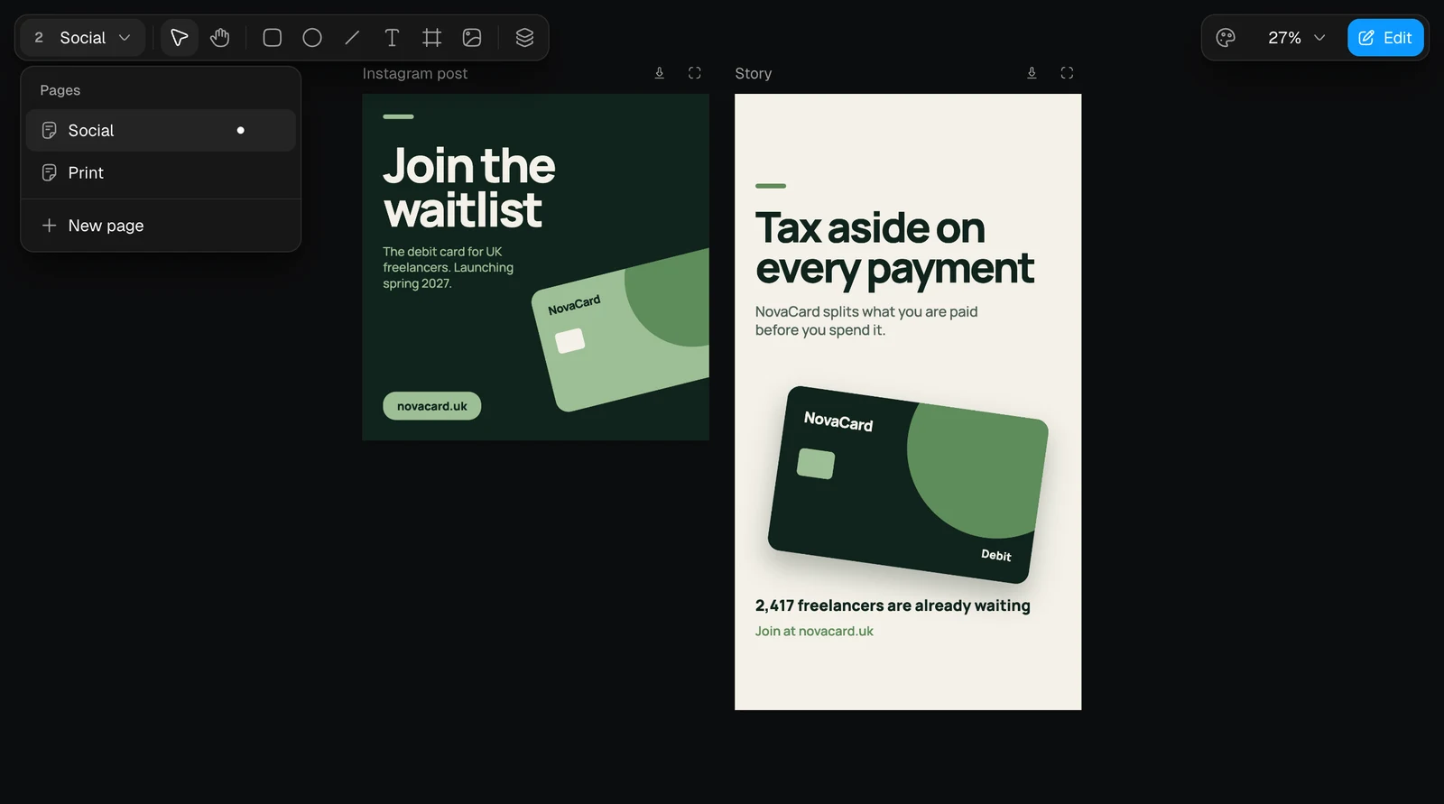
The Pages menu with Social, Print and New page, light themeThe Pages menu with Social, Print and New page, dark theme
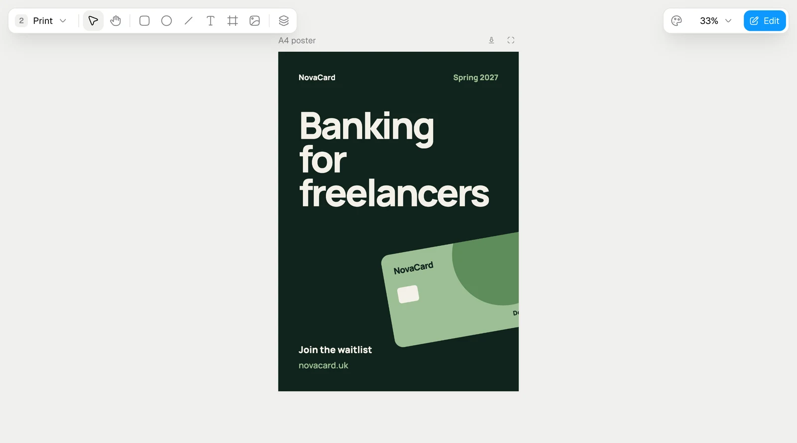
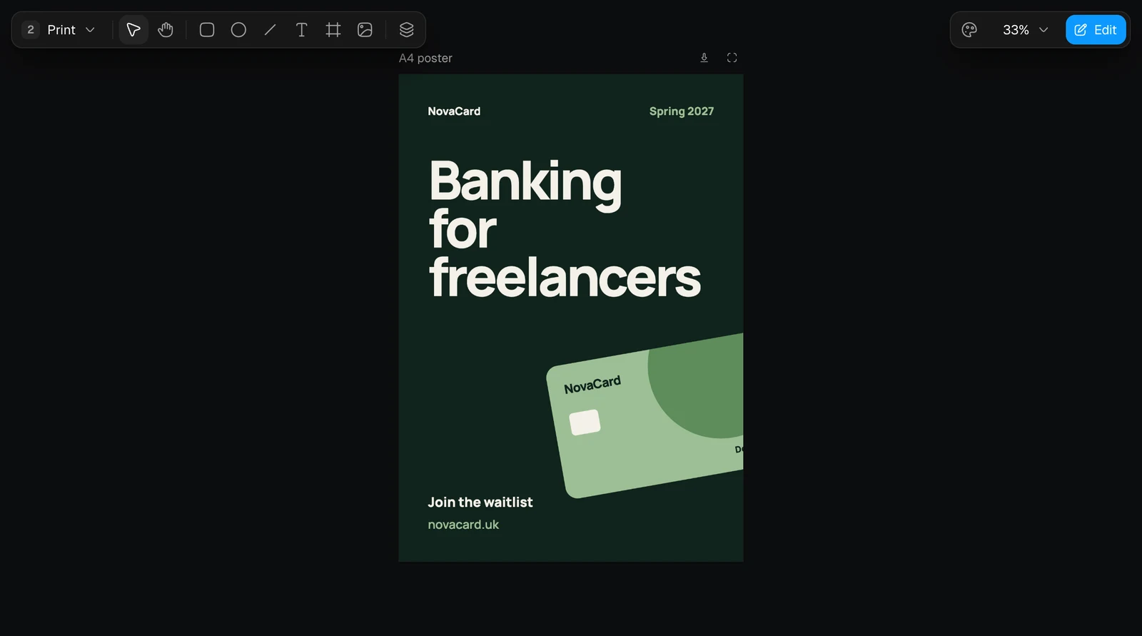
The Print page with an A4 poster, light themeThe Print page with an A4 poster, dark theme
Each page has its own menu with Rename and Delete.
The page menu with Rename and Delete, light themeThe page menu with Rename and Delete, dark theme
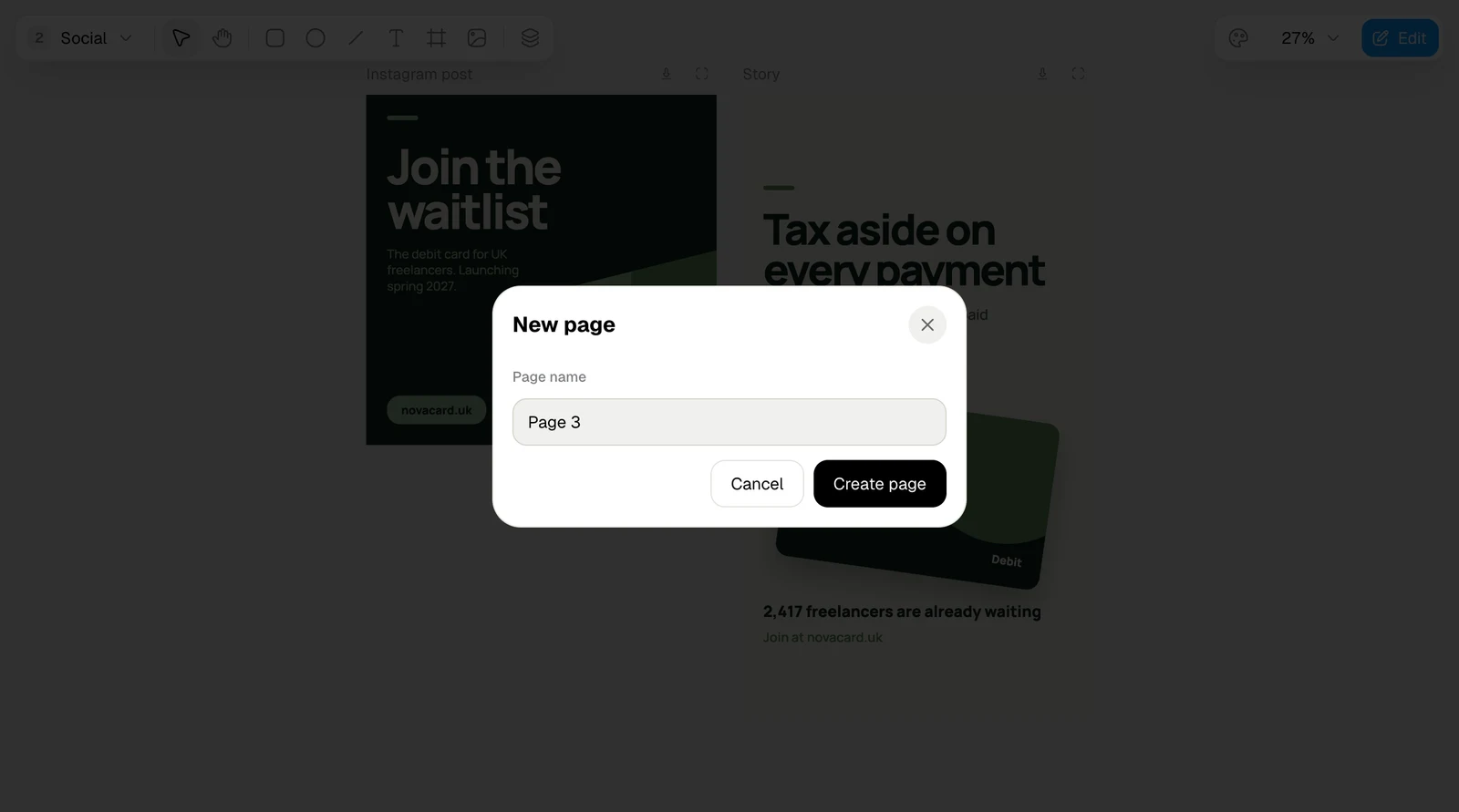
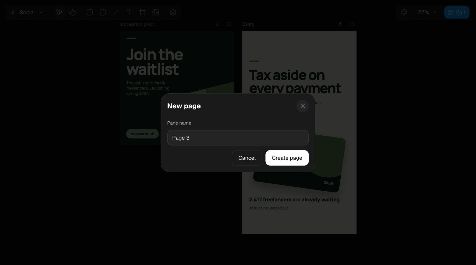
The New page dialog with Page name and Create page, light themeThe New page dialog with Page name and Create page, dark theme
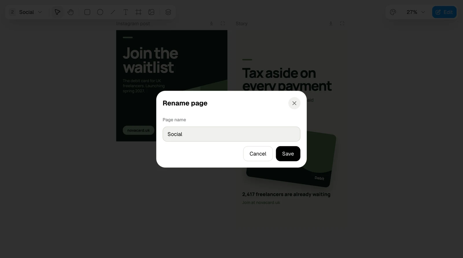
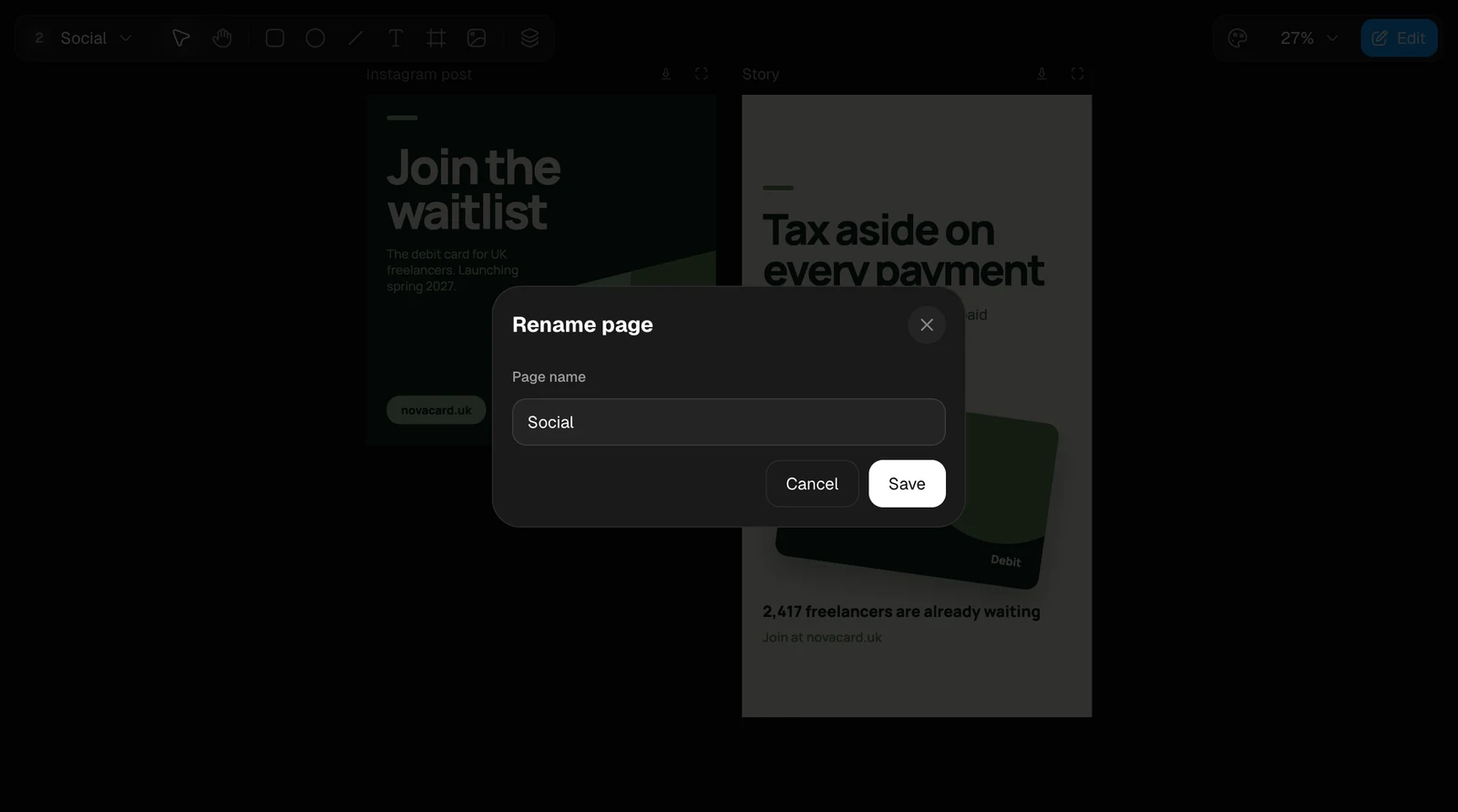
The Rename page dialog, light themeThe Rename page dialog, dark theme

The panel

Click an artboard’s name to select the whole artboard. The panel on the right has up to three tabs:
TabWhat it holds
PropertiesThe properties of the selected element. With the artboard itself selected, it asks you to pick an element inside
Design systemThe colours, text styles, spacing and corners of the design
TweaksThe levers of this artboard, when it has them
A selected artboard with the Properties, Design system and Tweaks tabs, light themeA selected artboard with the Properties, Design system and Tweaks tabs, dark theme
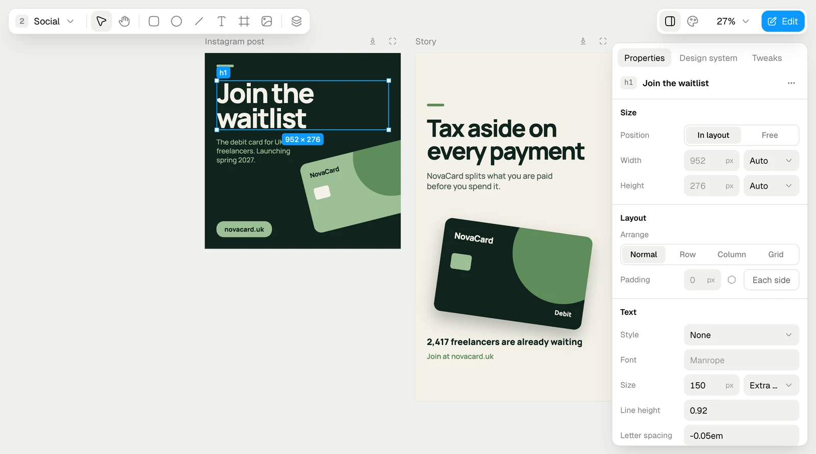
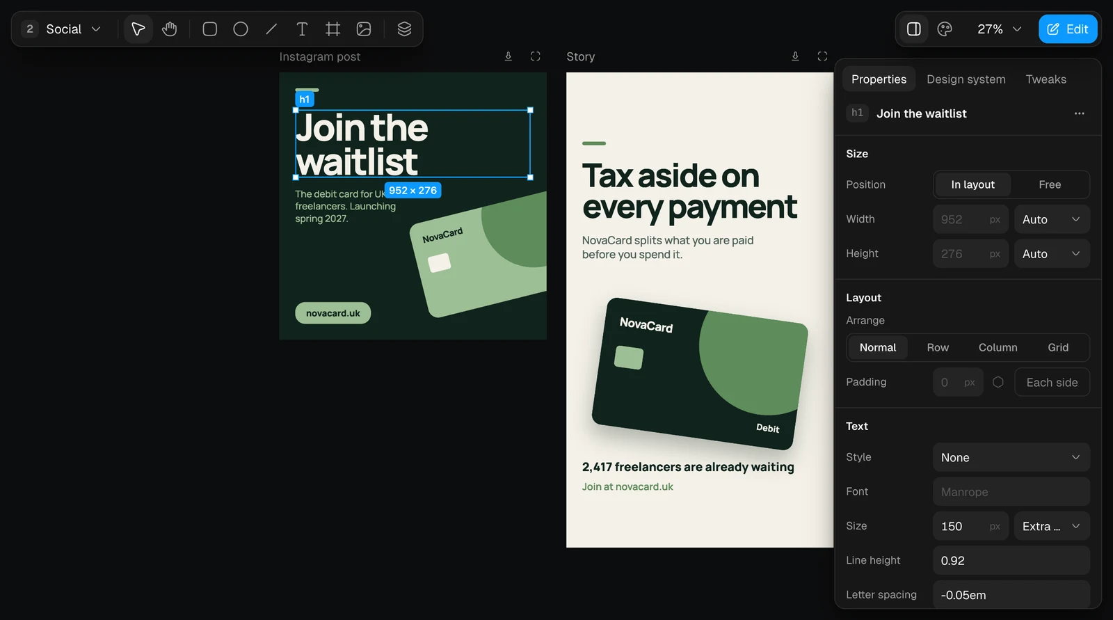
A selected headline with its properties, light themeA selected headline with its properties, dark theme

Design system

A design can carry a design system: the brand’s named colours, text styles, spacing and corners. The agent sets it up when it makes the design, from your brand or from what you ask for. The palette button at the top right opens it on the Design system tab. Every colour has a name and a note on where it is used. Change a colour there, by its swatch or its value, and every place in the design that uses it changes with it.
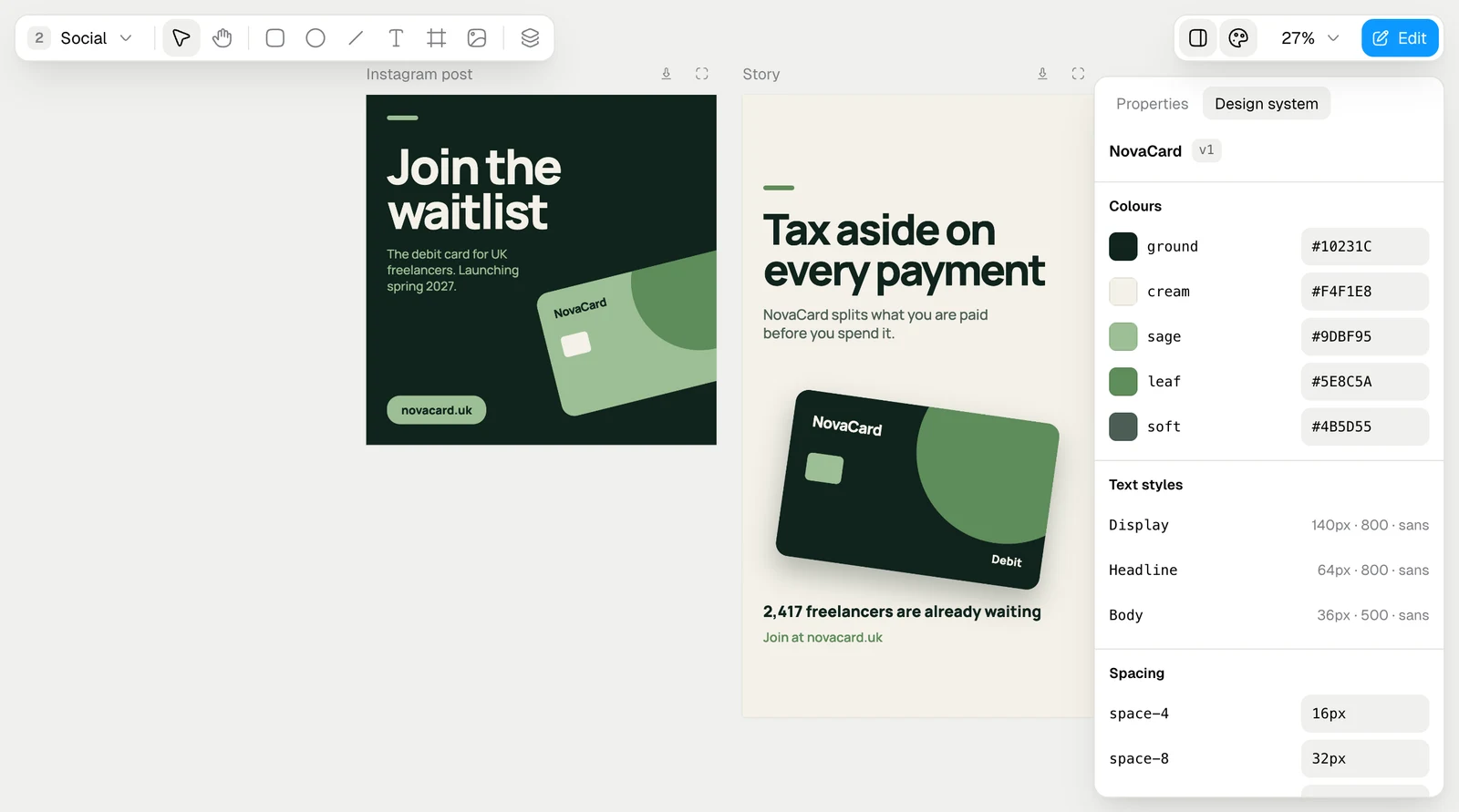
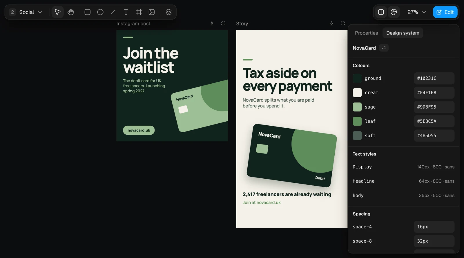
The Design system tab with Colours, Text styles and Spacing, light themeThe Design system tab with Colours, Text styles and Spacing, dark theme
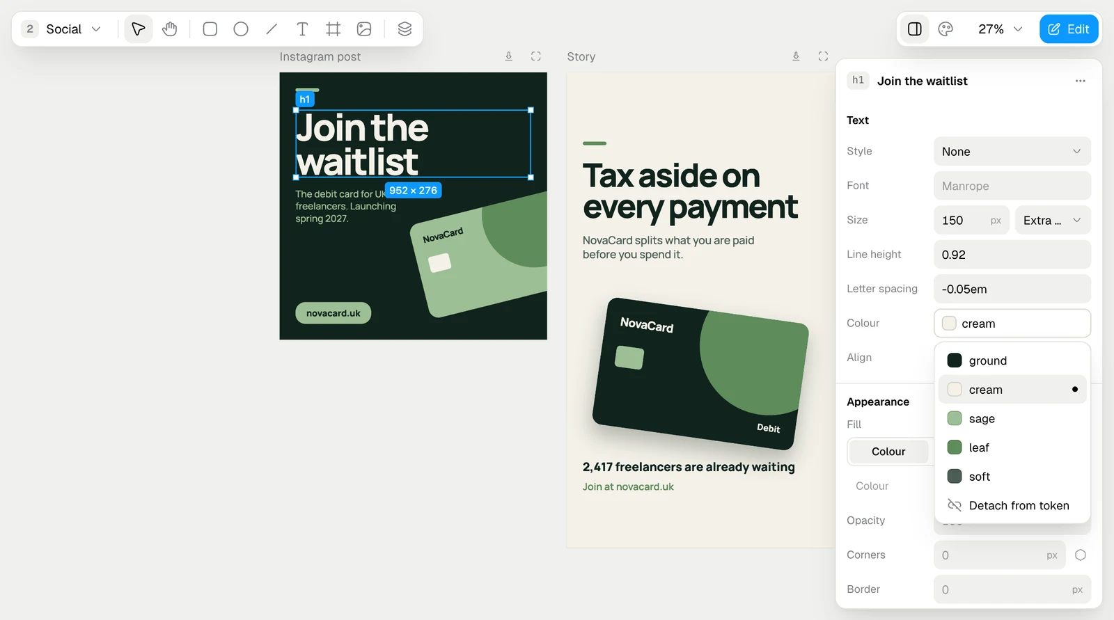
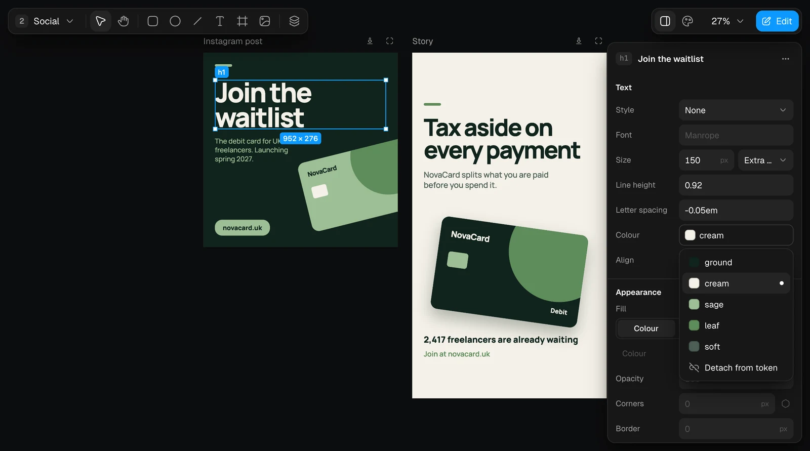
In the properties, Style gives text one of the system’s text styles, and a colour from the system shows as its name: cream, not a hex code. Click it to pick another colour of the system, or Detach from token to set a colour of its own.
The colour token list with ground, cream, sage, leaf, soft and Detach from token, light themeThe colour token list with ground, cream, sage, leaf, soft and Detach from token, dark theme

Components

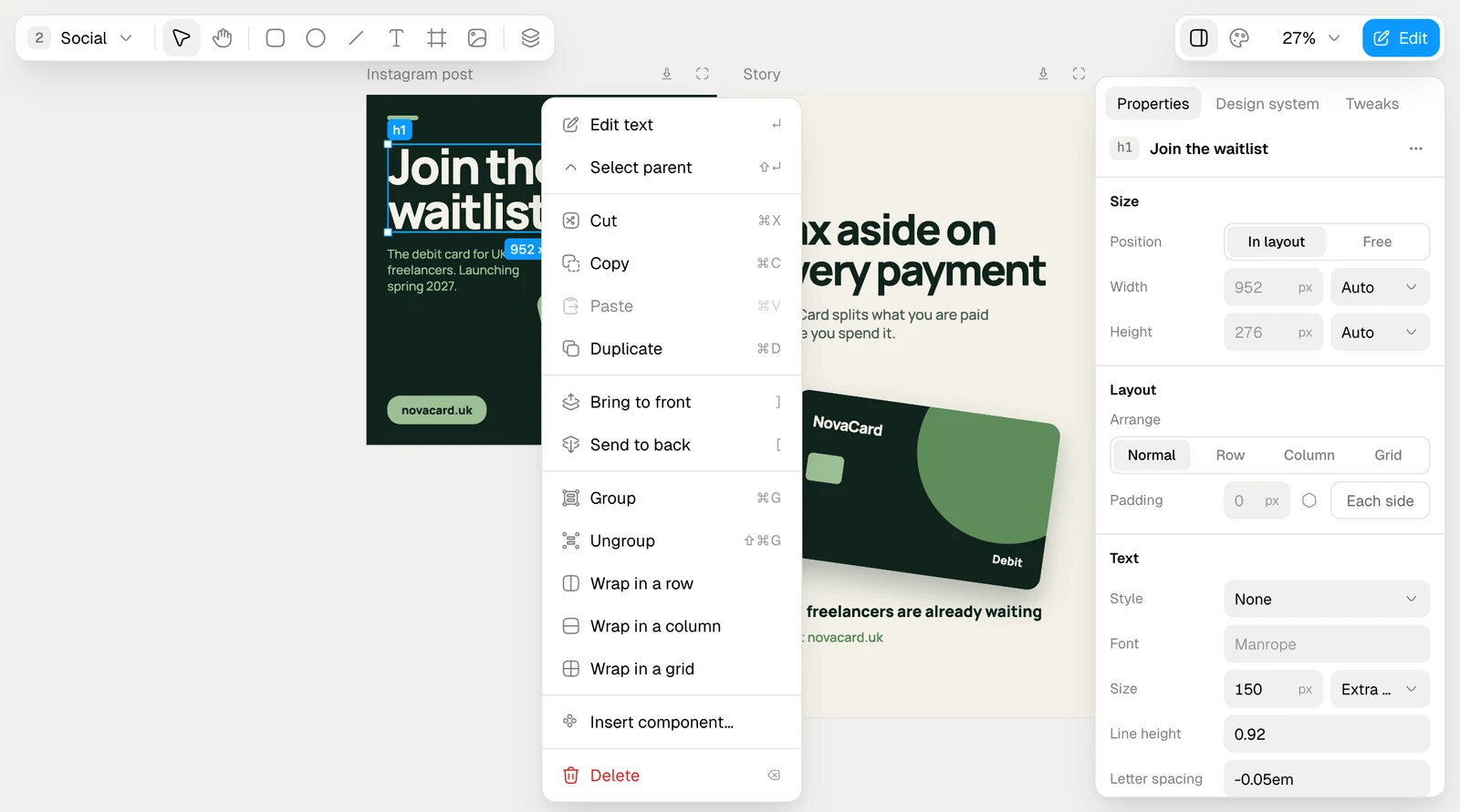
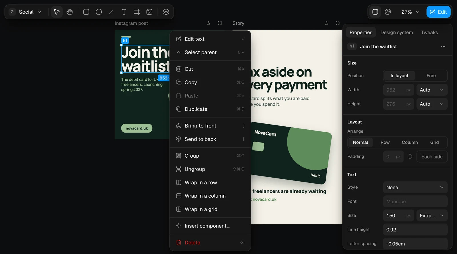
Insert component… in the element actions places another artboard of the design inside this one. The copy, an instance, follows its component: change the component and every instance changes with it.
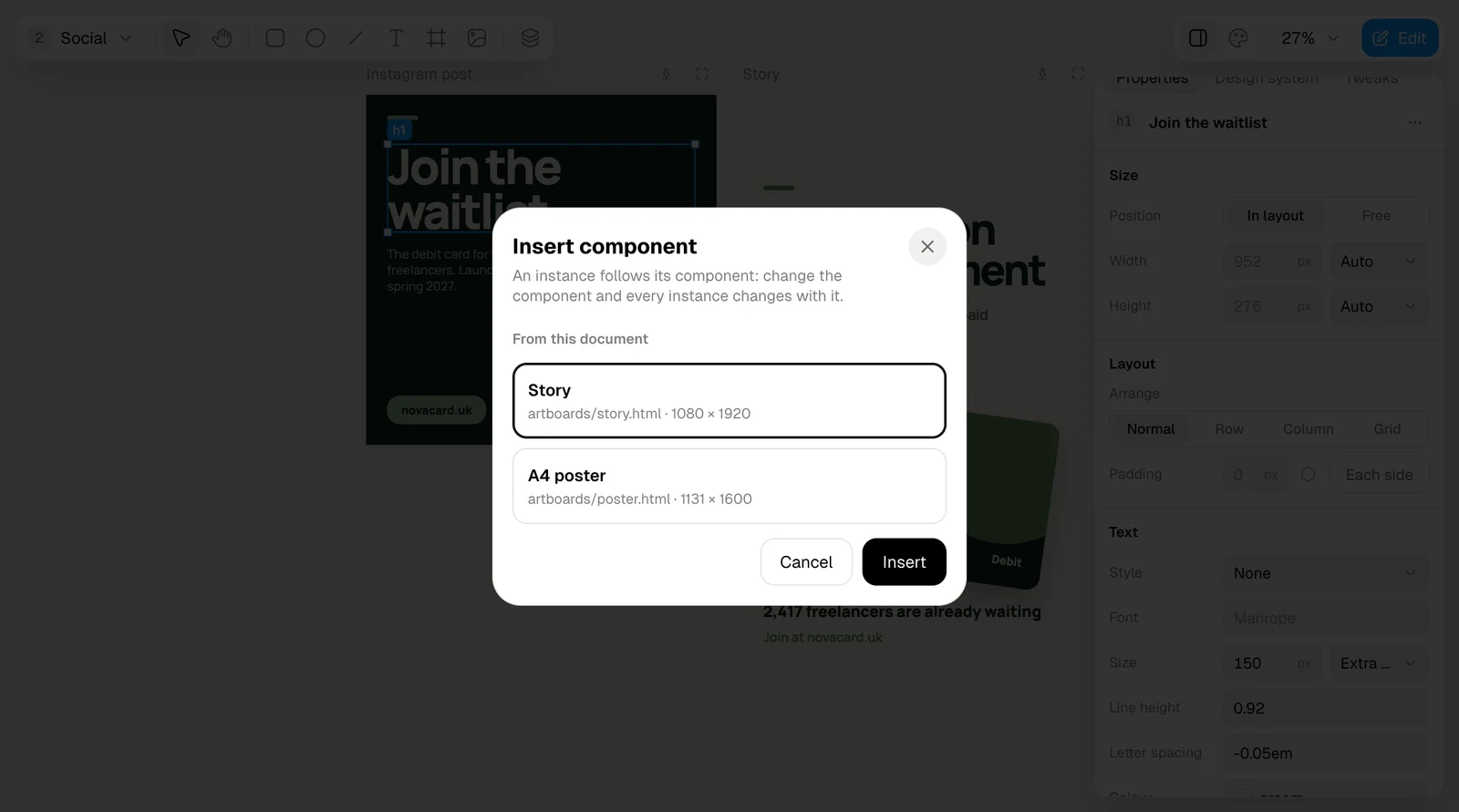
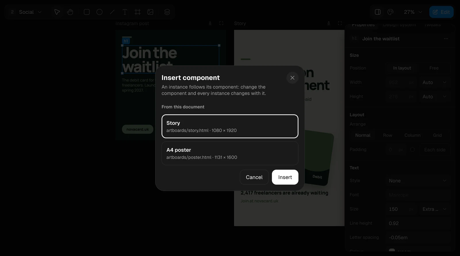
The Insert component dialog with Story and A4 poster, light themeThe Insert component dialog with Story and A4 poster, dark theme
The element menu on a design, light themeThe element menu on a design, dark theme

Tweaks

Some artboards come with tweaks: a few levers the agent left for quick changes, such as the accent colour or how round the corners are. They are on the Tweaks tab. A tweak changes only its own artboard.
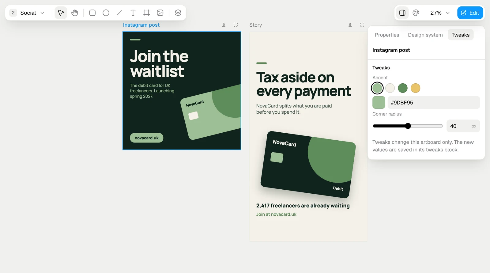
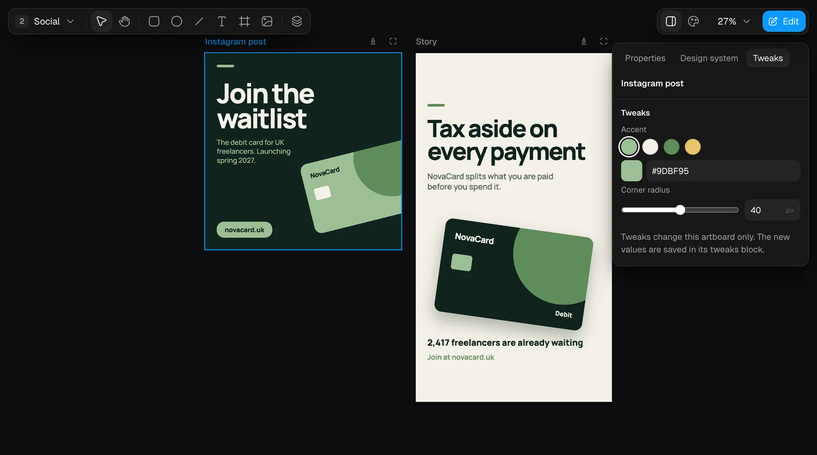
The Tweaks tab with accent swatches and a corner radius slider, light themeThe Tweaks tab with accent swatches and a corner radius slider, dark theme

Layers

Layers shows the tree of the selected artboard.
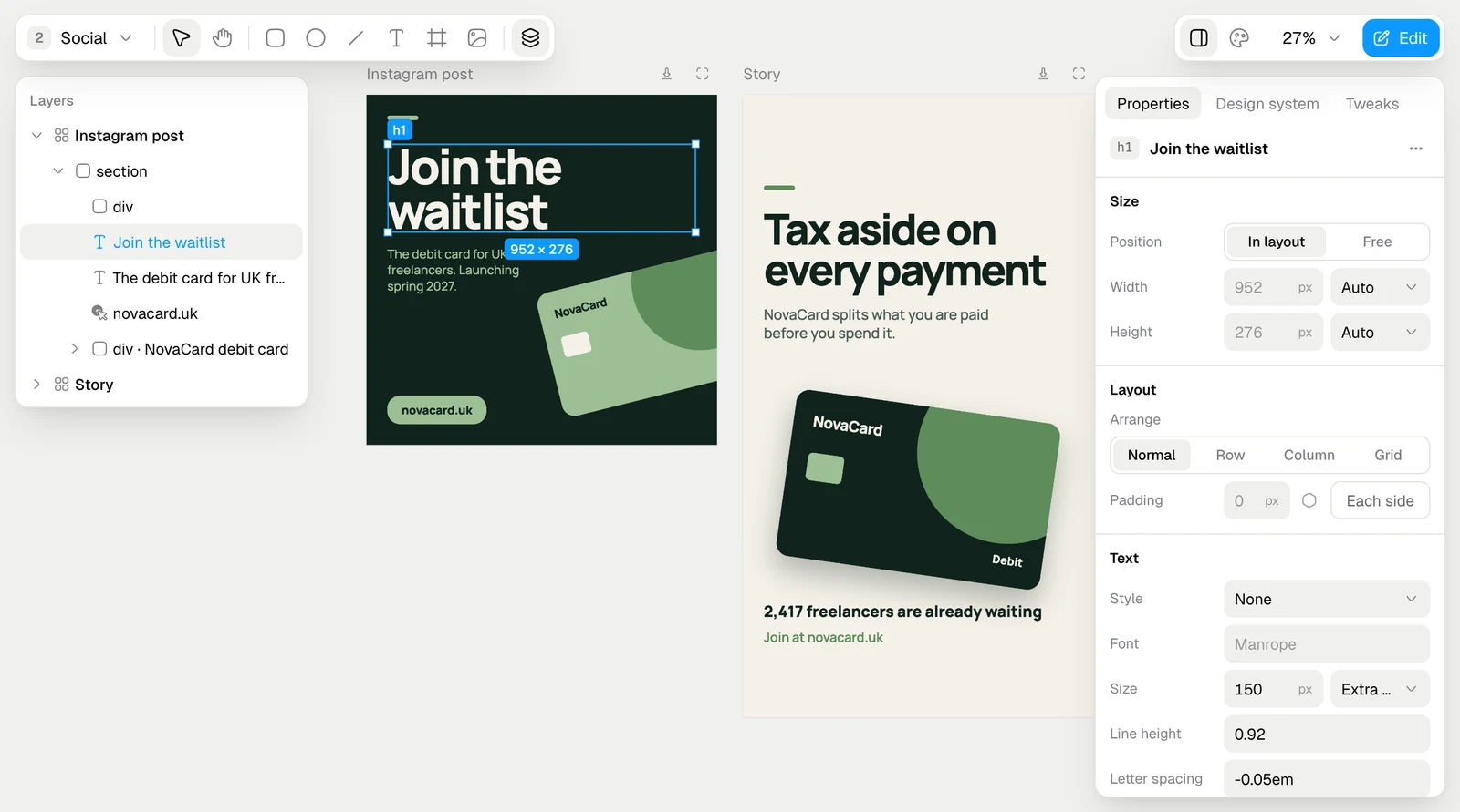
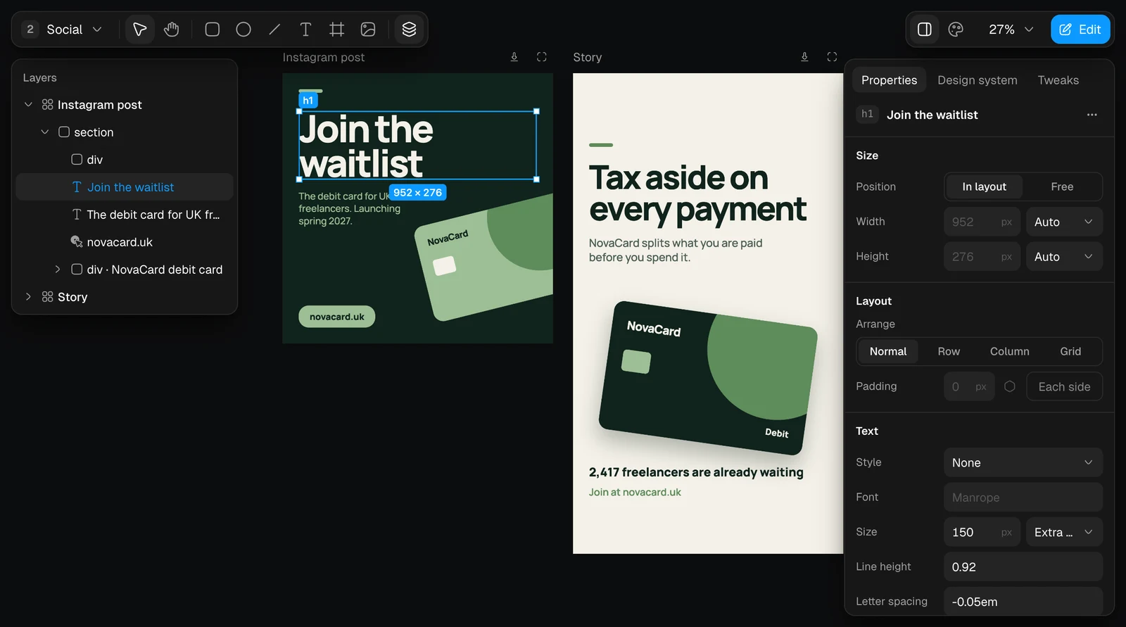
The Layers panel of the Instagram post, light themeThe Layers panel of the Instagram post, dark theme

Look at one artboard

Open on its own above an artboard shows it filling the editor. The arrows go through the artboards of the page, Tweaks opens its tweaks, and × returns to the canvas.
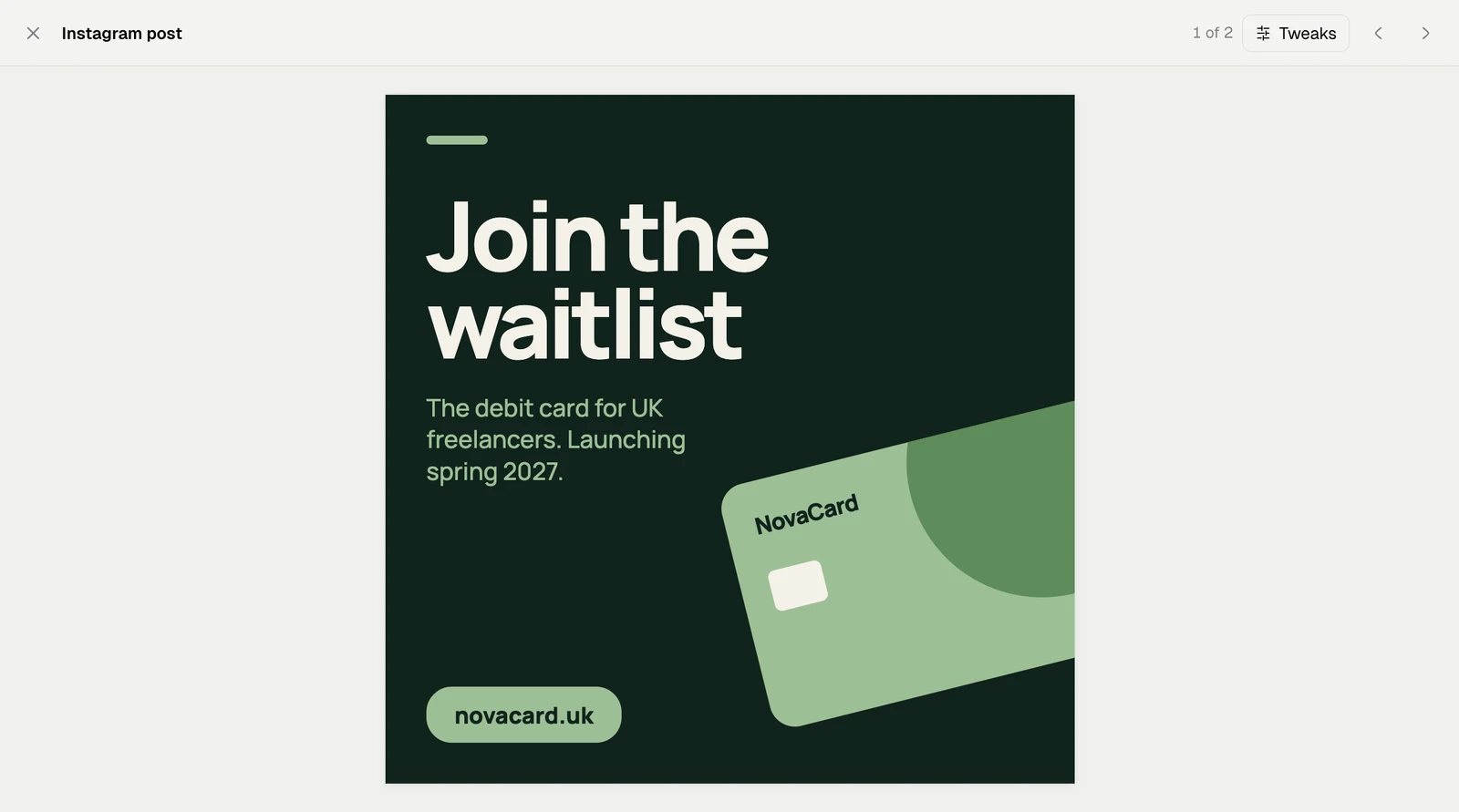
One artboard filling the editor, light themeOne artboard filling the editor, dark theme
The zoom menu works as in Slides: zoom in and out, fit (⇧1), 50%, 100% (⇧0) and 200%.
The zoom menu of the Design editor, light themeThe zoom menu of the Design editor, dark theme

Download an artboard

Download above an artboard saves that artboard alone as an HTML file, one file that opens in any browser. PNG image and PDF in this menu are greyed out in Jobbit: to get pictures or a PDF, use Download at the top of the window, which saves every artboard. See Download.
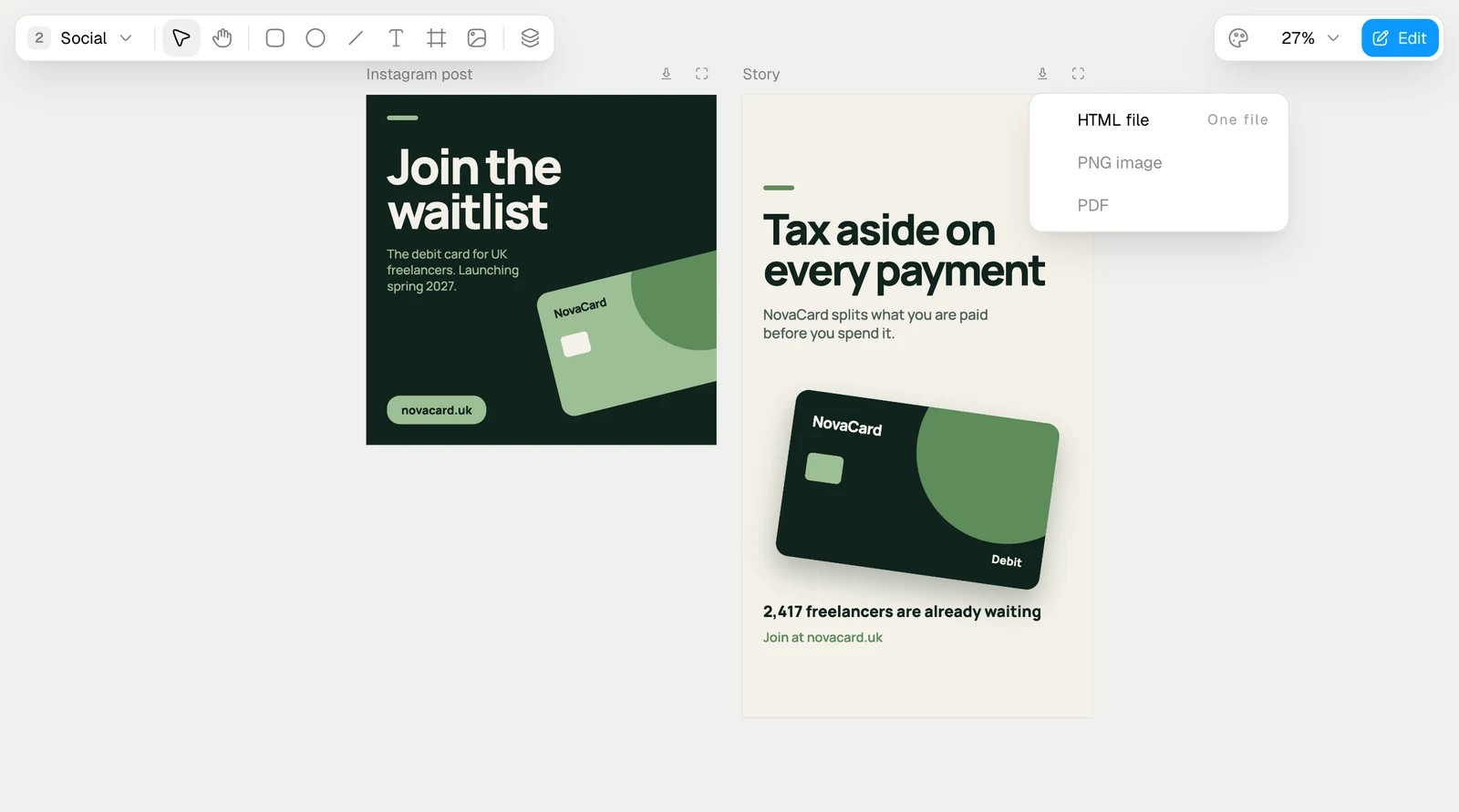
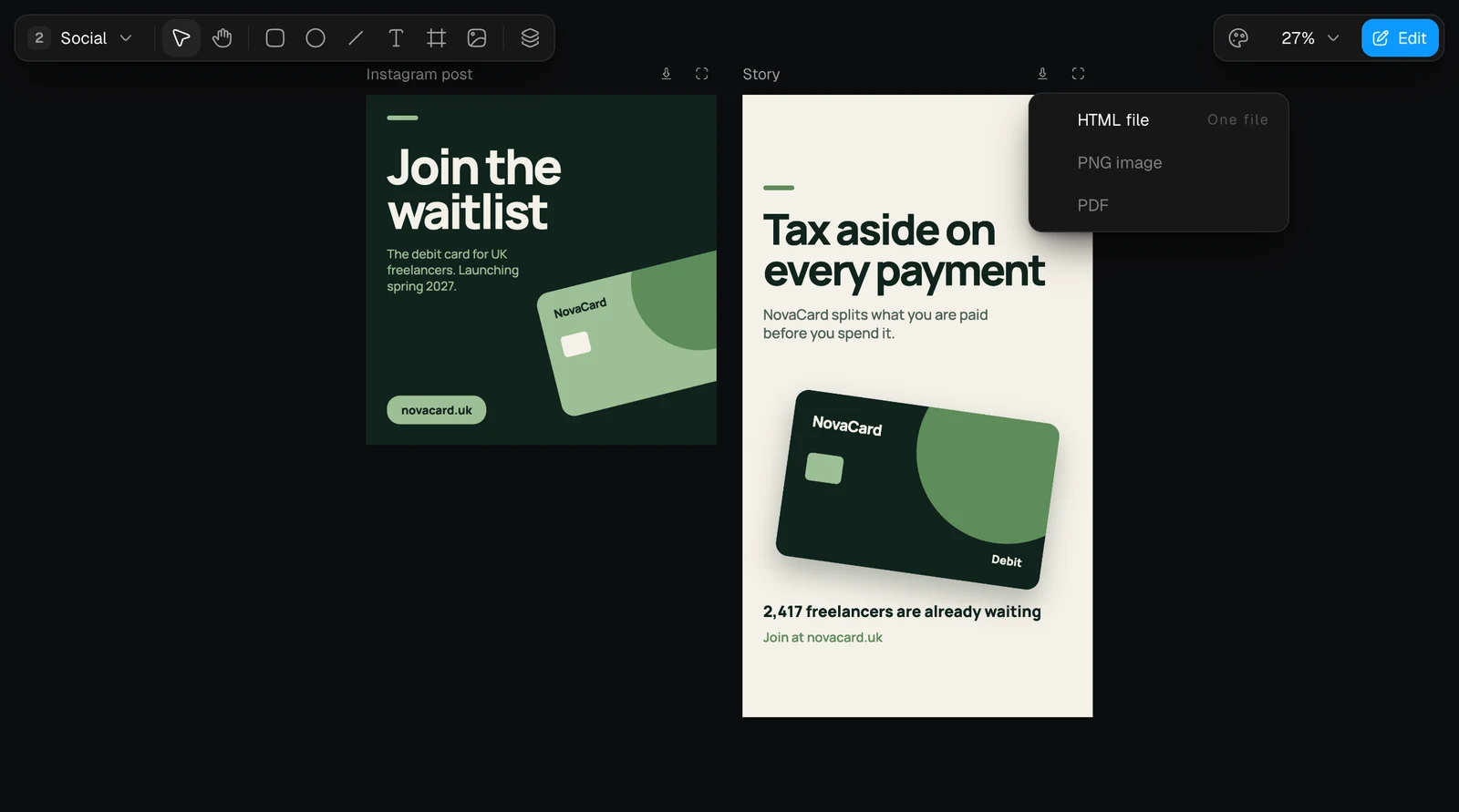
The artboard download menu with HTML file, PNG image and PDF, light themeThe artboard download menu with HTML file, PNG image and PDF, dark theme

Look without editing

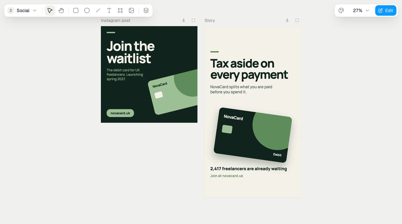
Someone who can only view the design sees the artboards and the zoom, without the tools and without Edit.
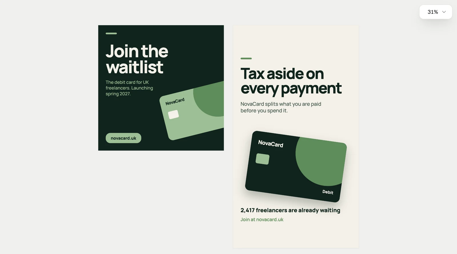
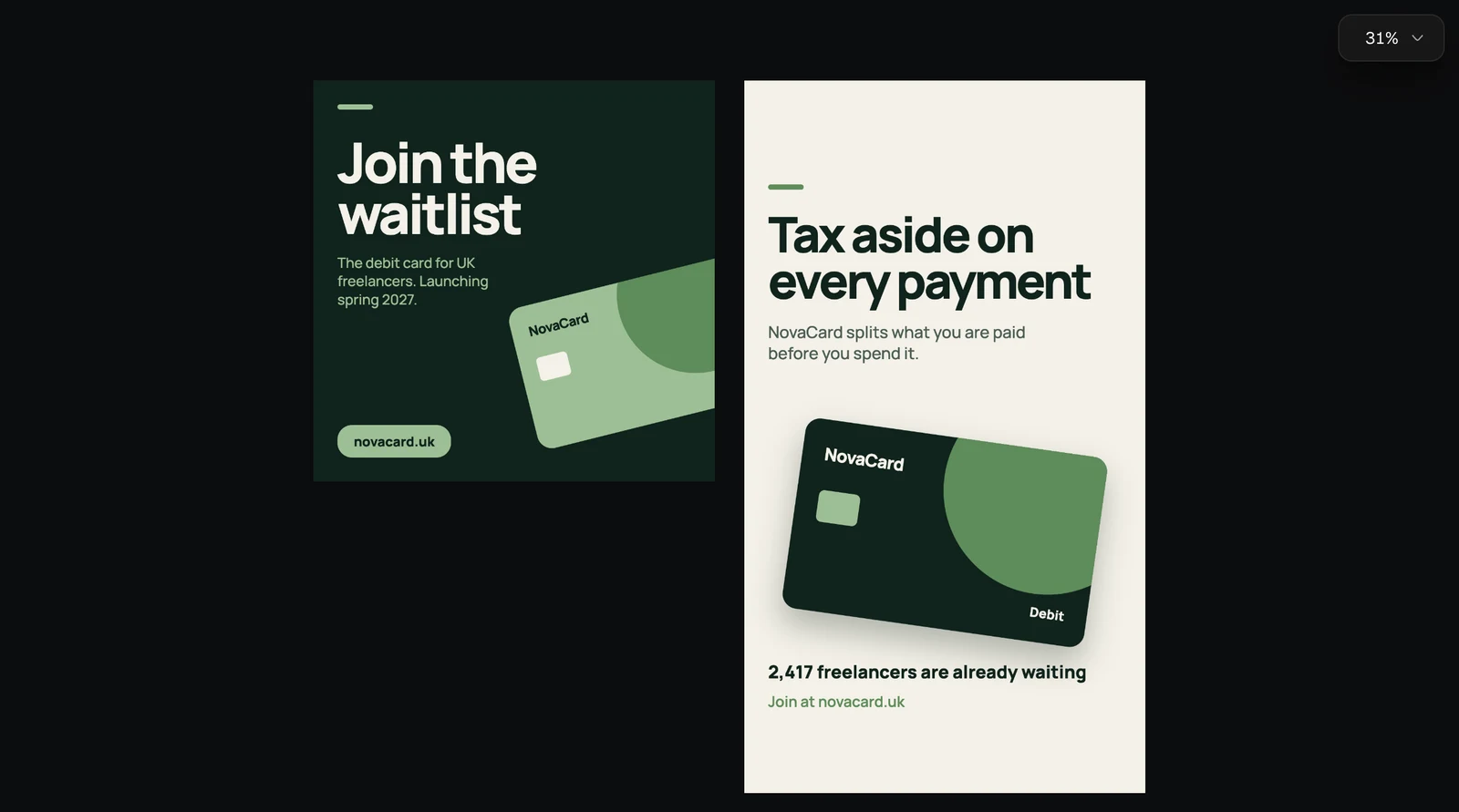
The design without editing tools, light themeThe design without editing tools, dark theme

Beside a chat

In the panel beside a chat, the toolbars stack at the top.
The Design editor in the narrow chat panel, light themeThe Design editor in the narrow chat panel, dark theme